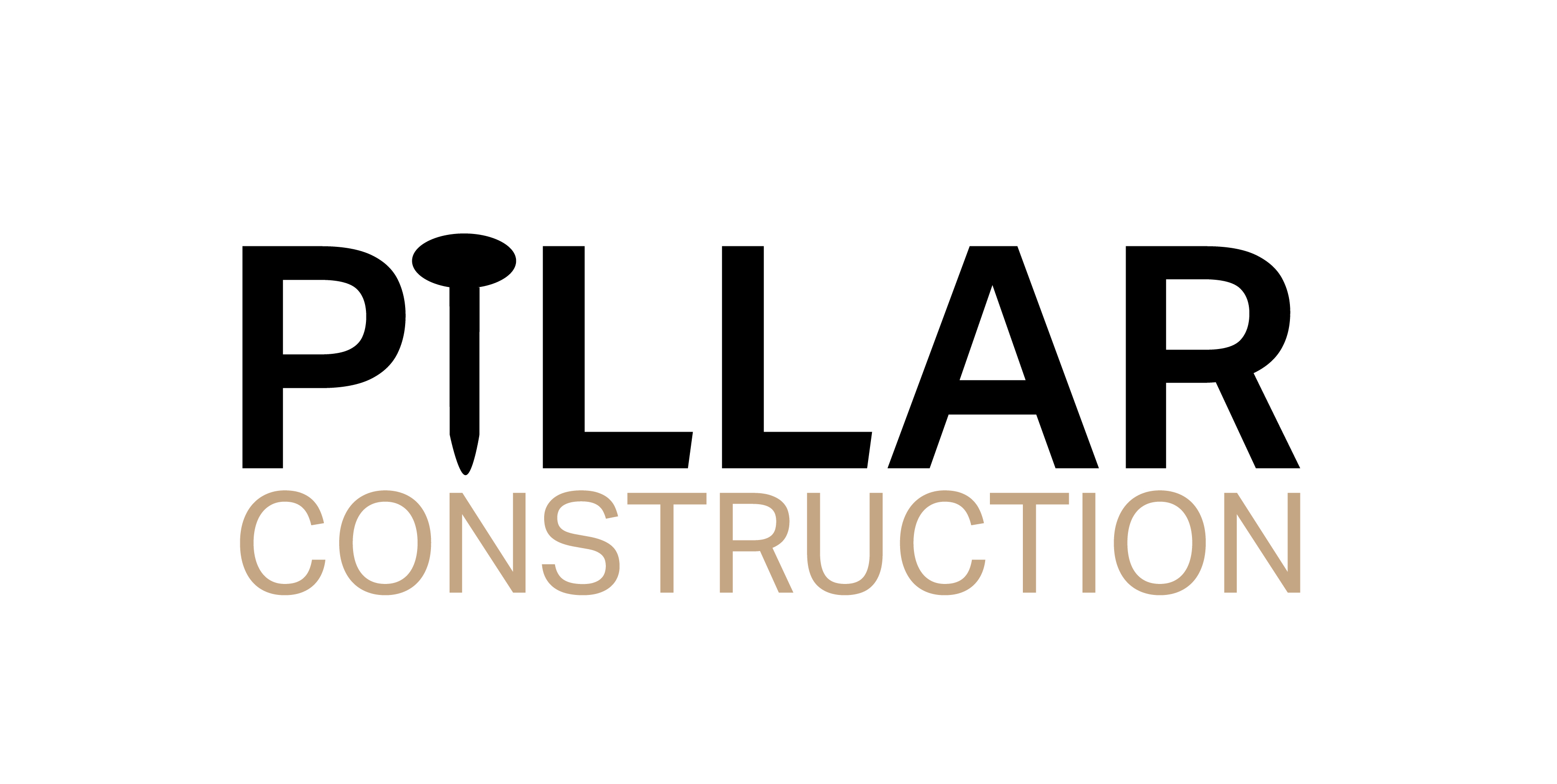
Pillar Construction

Project Description
Logo design for a growing carpentry and construction business
Logo design for a growing carpentry and construction business
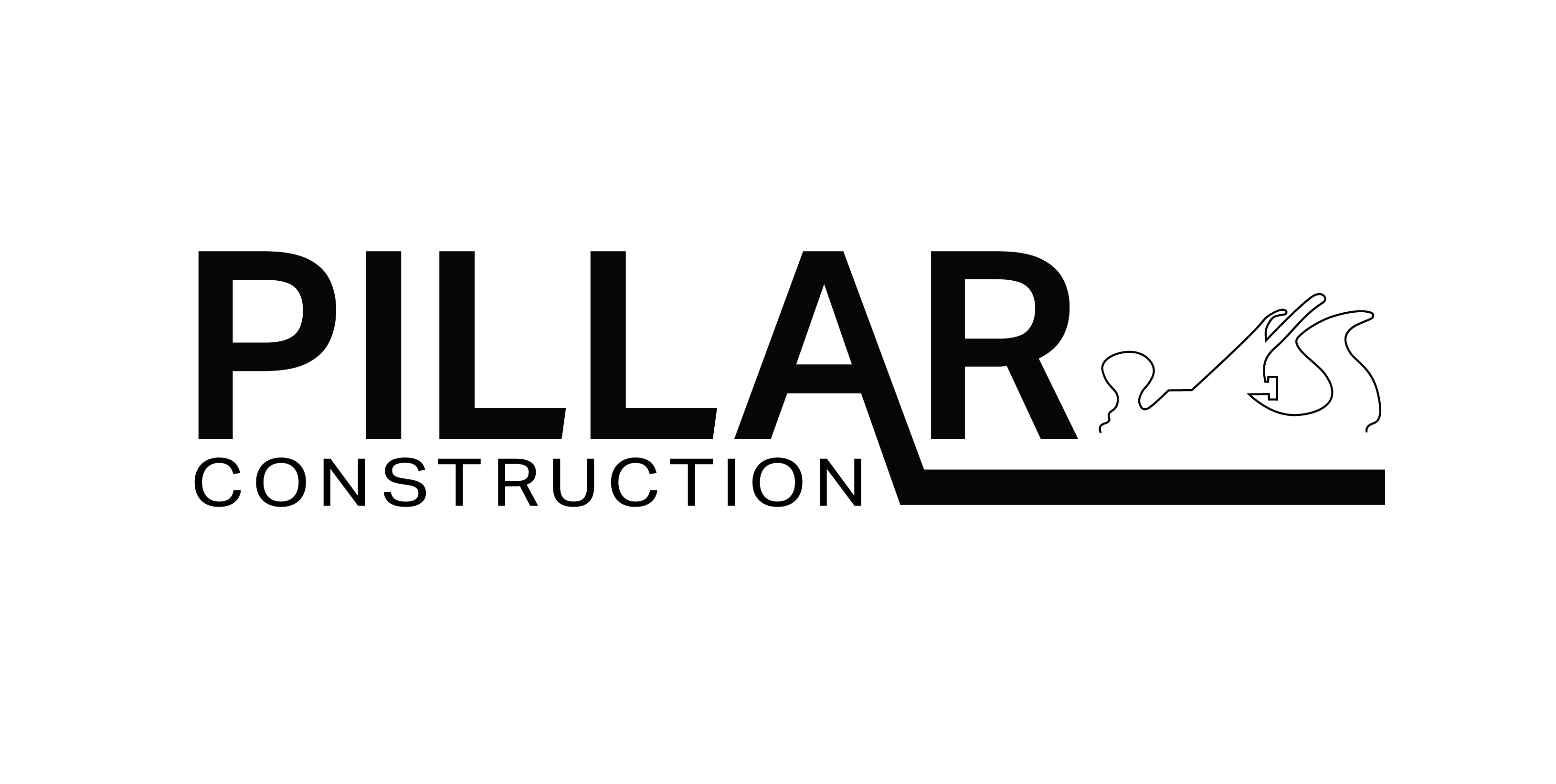
Concept Development
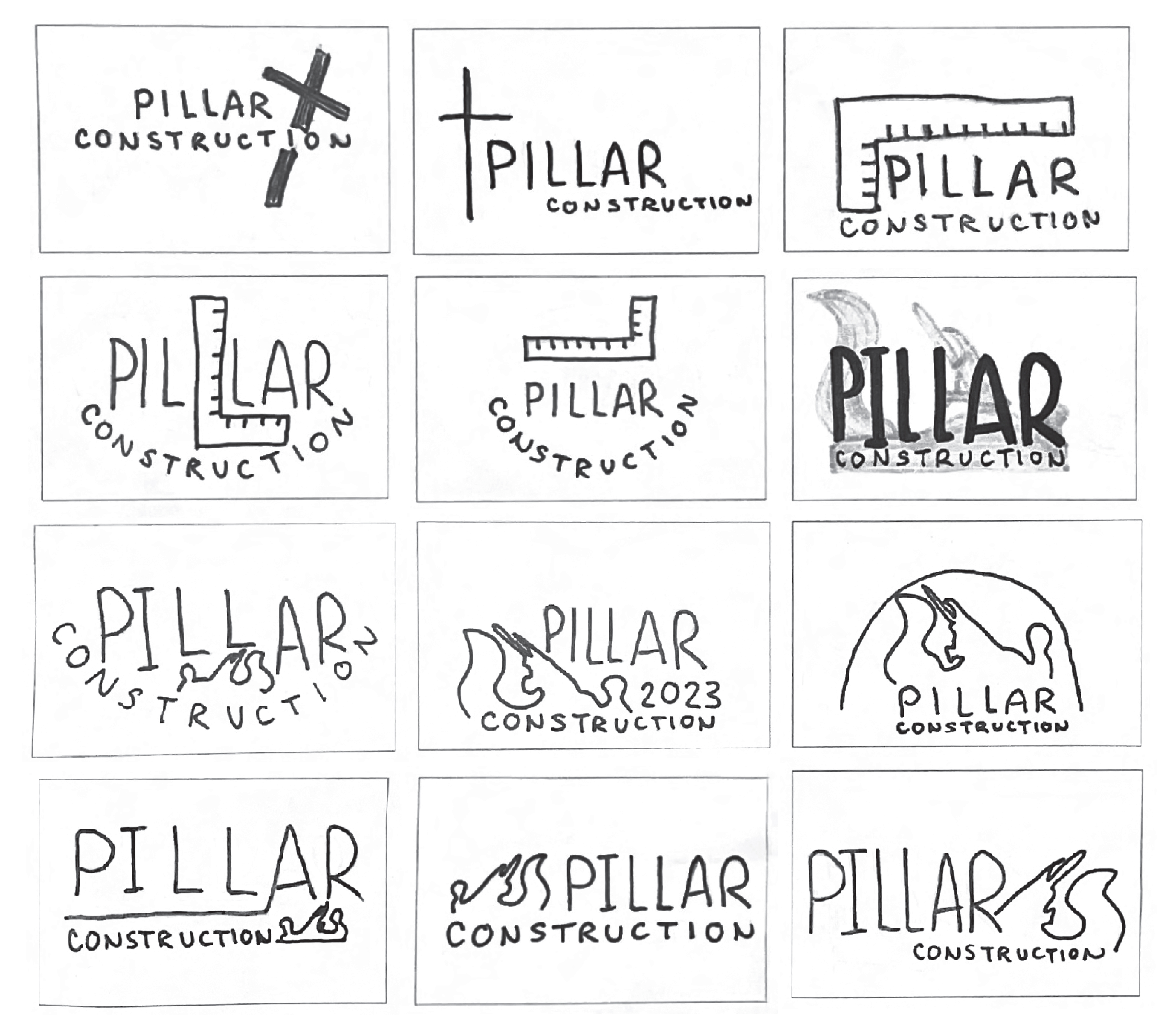
Concept sketches
![]()
Concept sketches
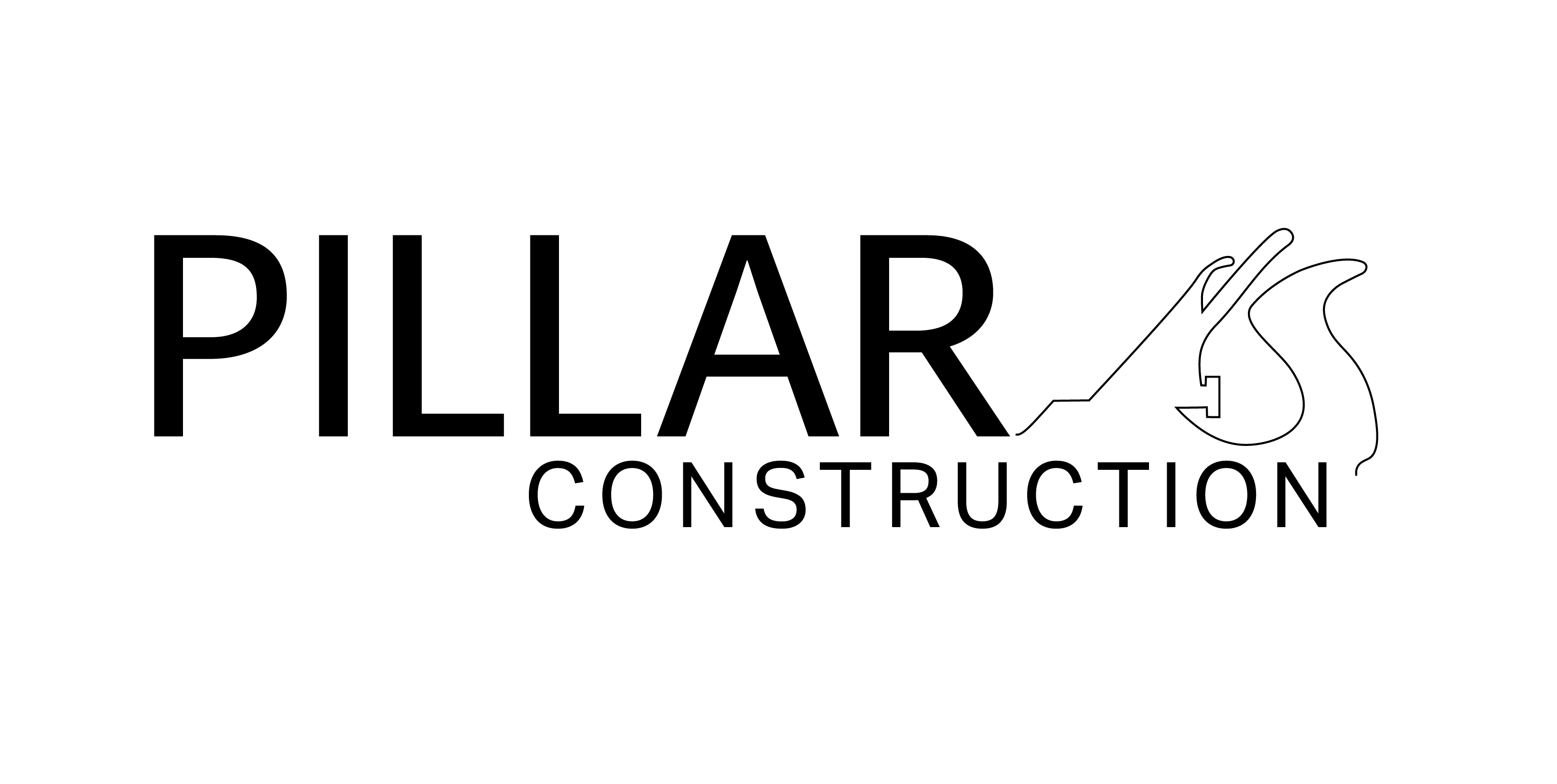
Digital process
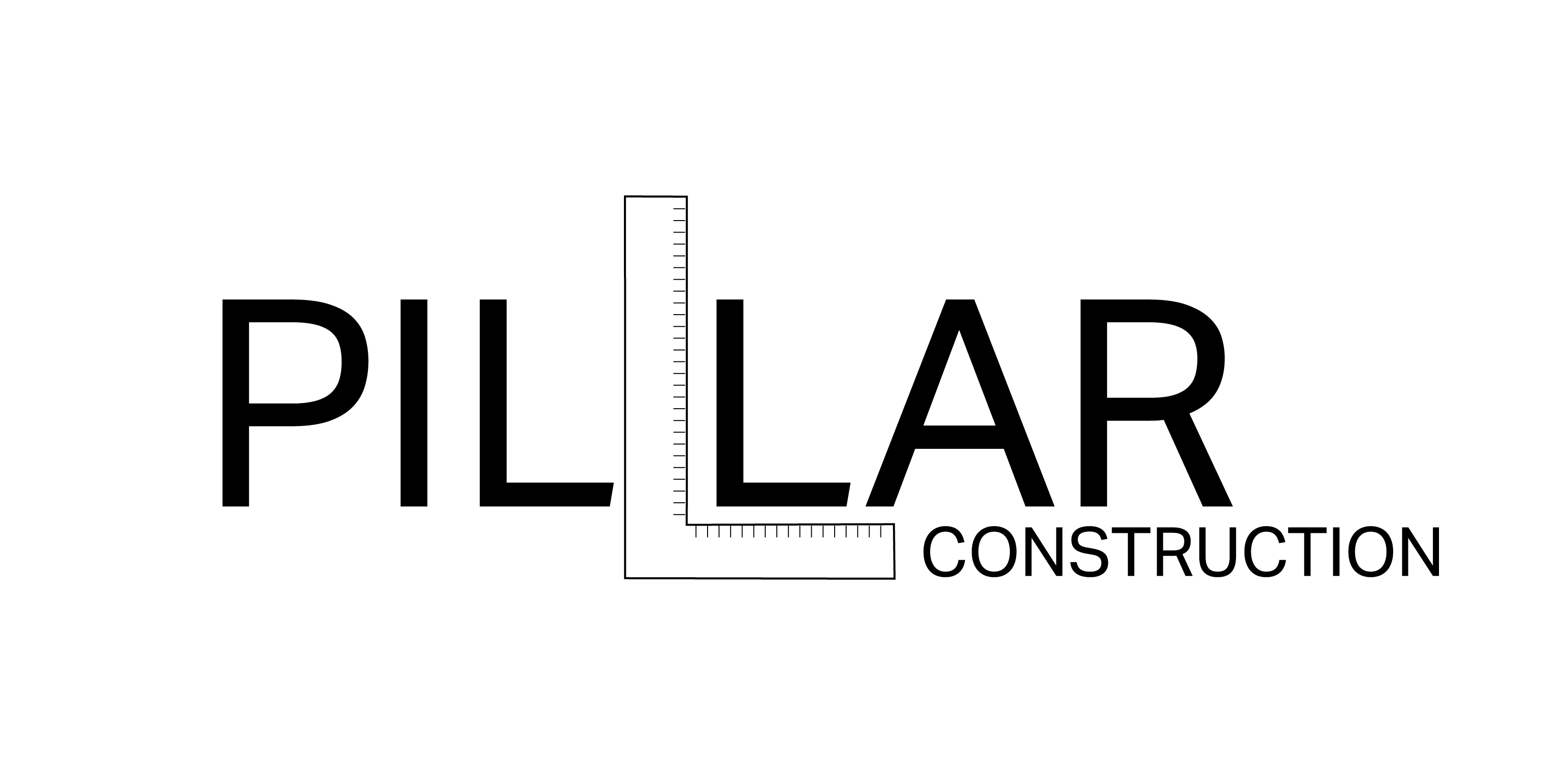


Final typefaces
Brando Sans was chosen for its contemporary look with its sharp edges and corners, straight stems, wide counters, and tall x-height.
Brando Sans was chosen for its contemporary look with its sharp edges and corners, straight stems, wide counters, and tall x-height.
My client expressed a desire for an additional typeface with a more rustic look. Veneer was chosen for its narrower width and chalky texture.

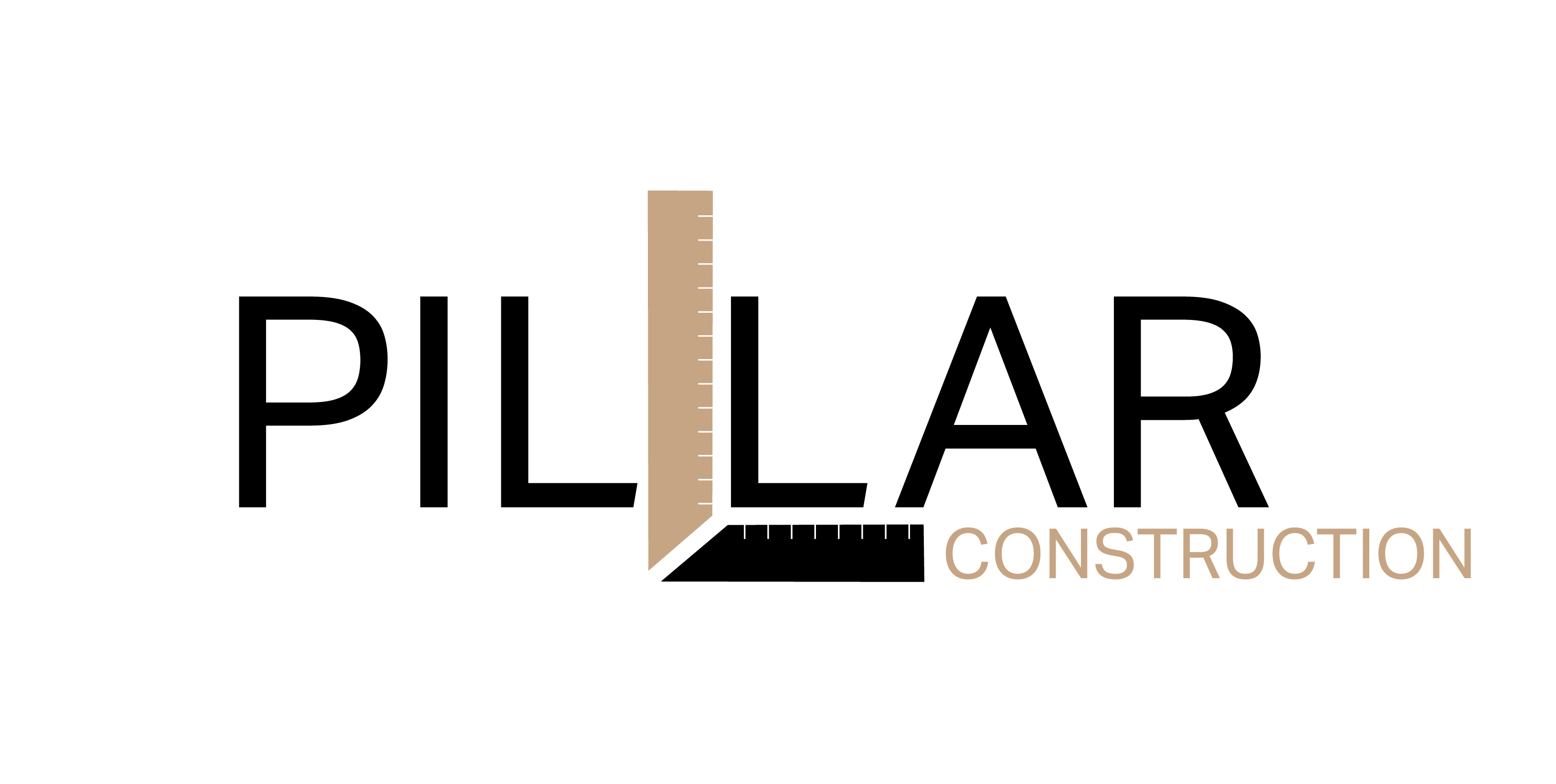
Color
Brown was chosen for its natural look, versatility, and compatibility with many other colors.
![]()
Brown was chosen for its natural look, versatility, and compatibility with many other colors.

Final Solution


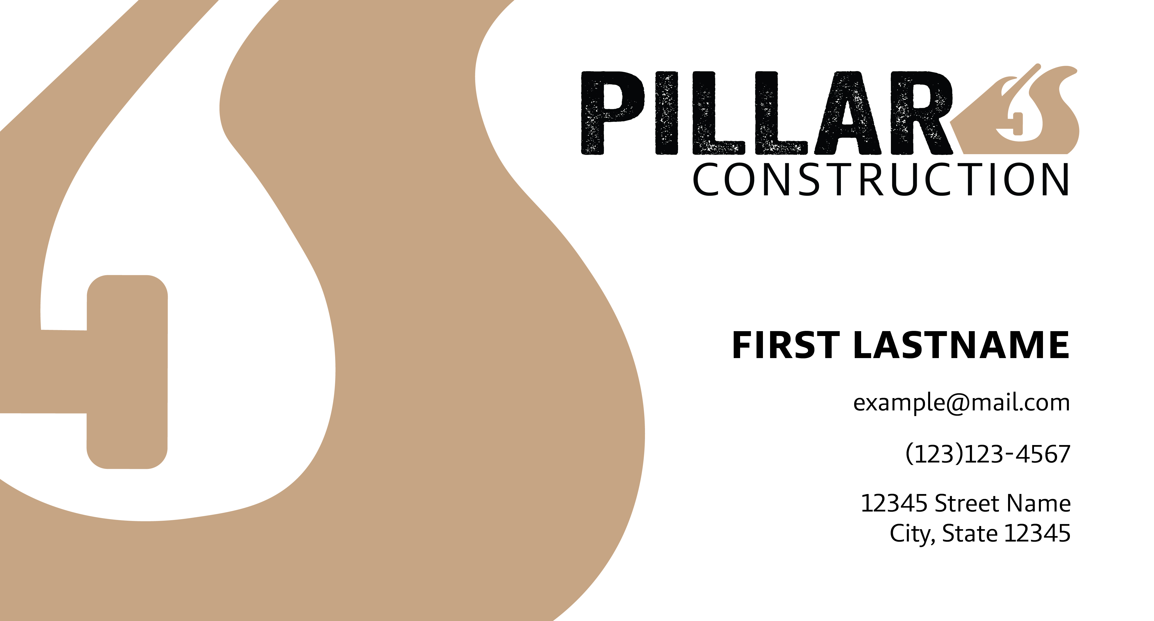
Business card
Icons