O’Hare Airport Mobile Interface Design

Project Description
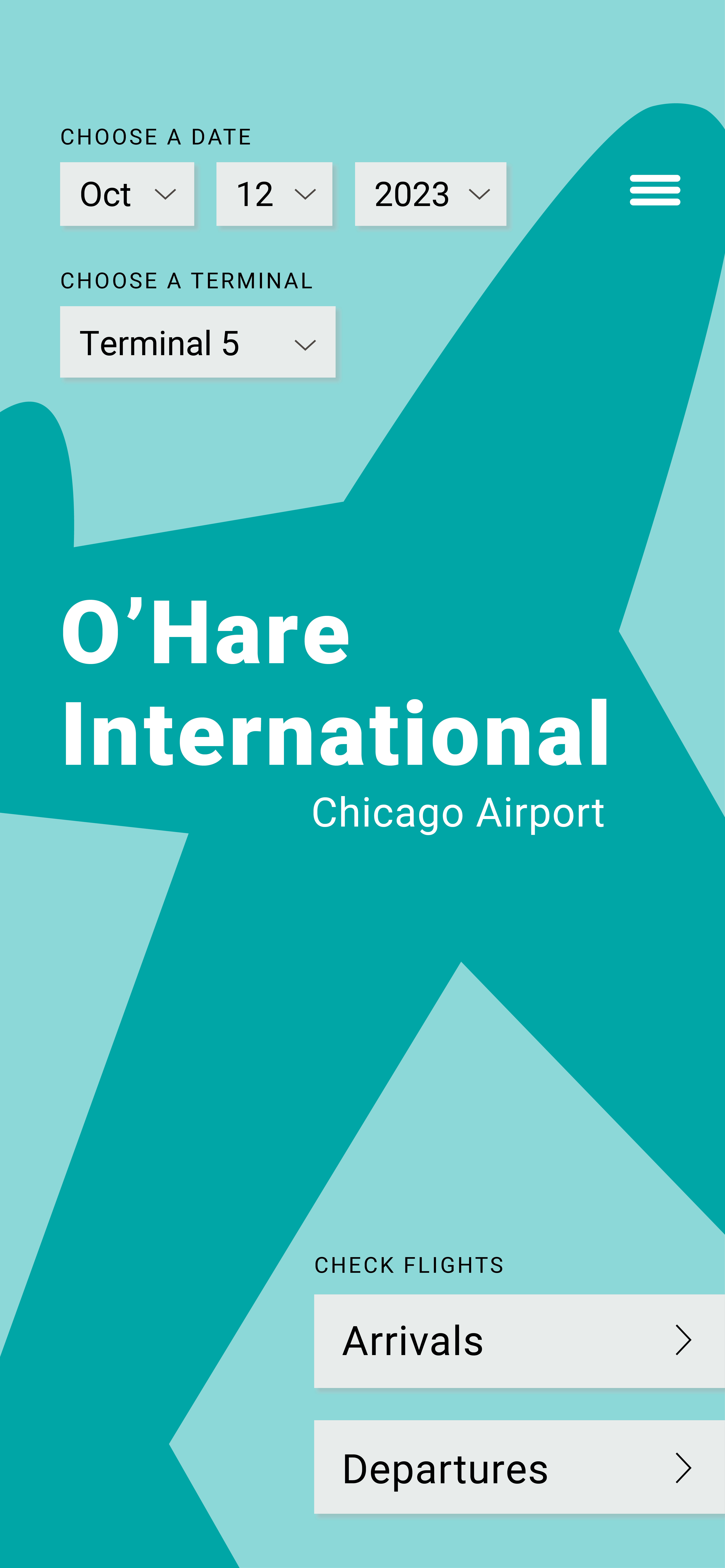
A mobile user interface for the arrival and departure flight information for O’Hare International Airport
A mobile user interface for the arrival and departure flight information for O’Hare International Airport
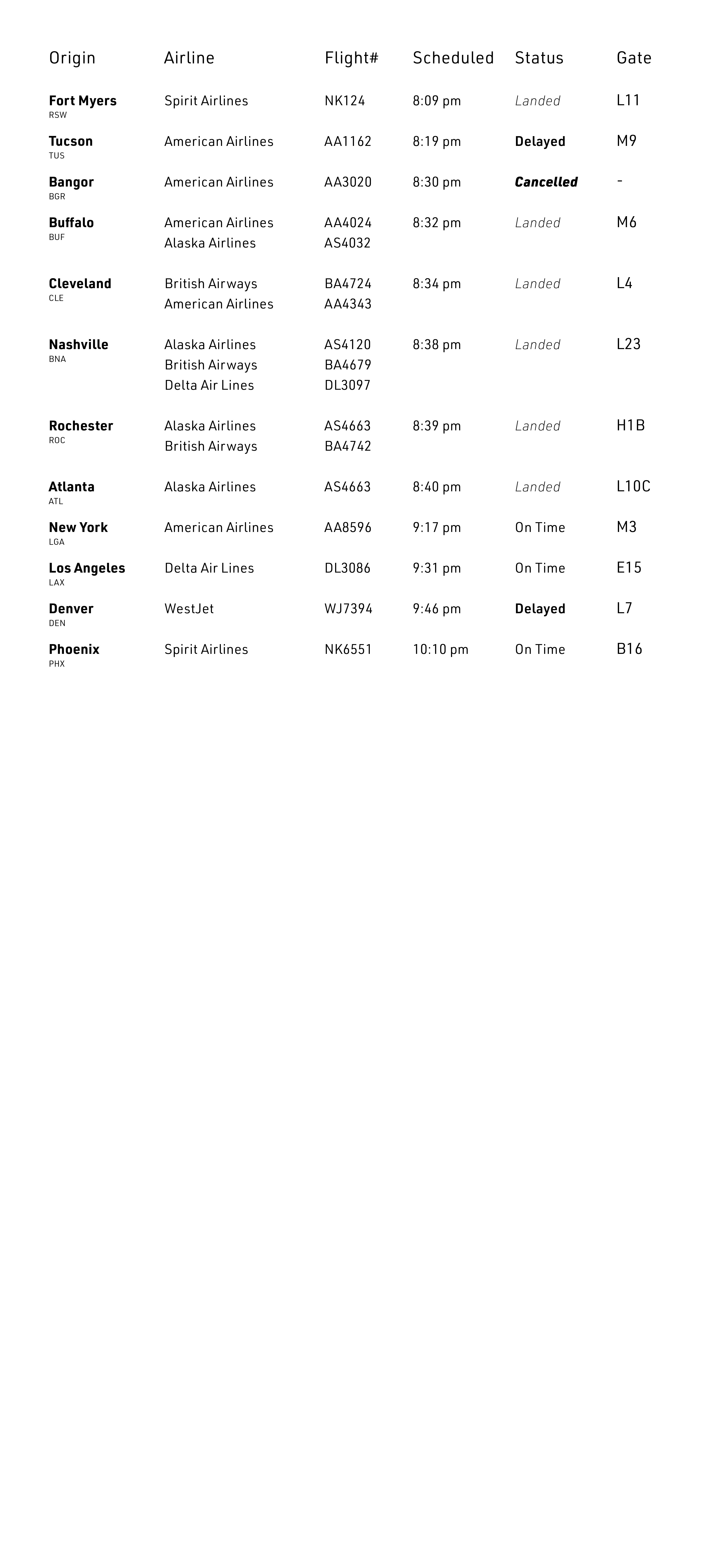
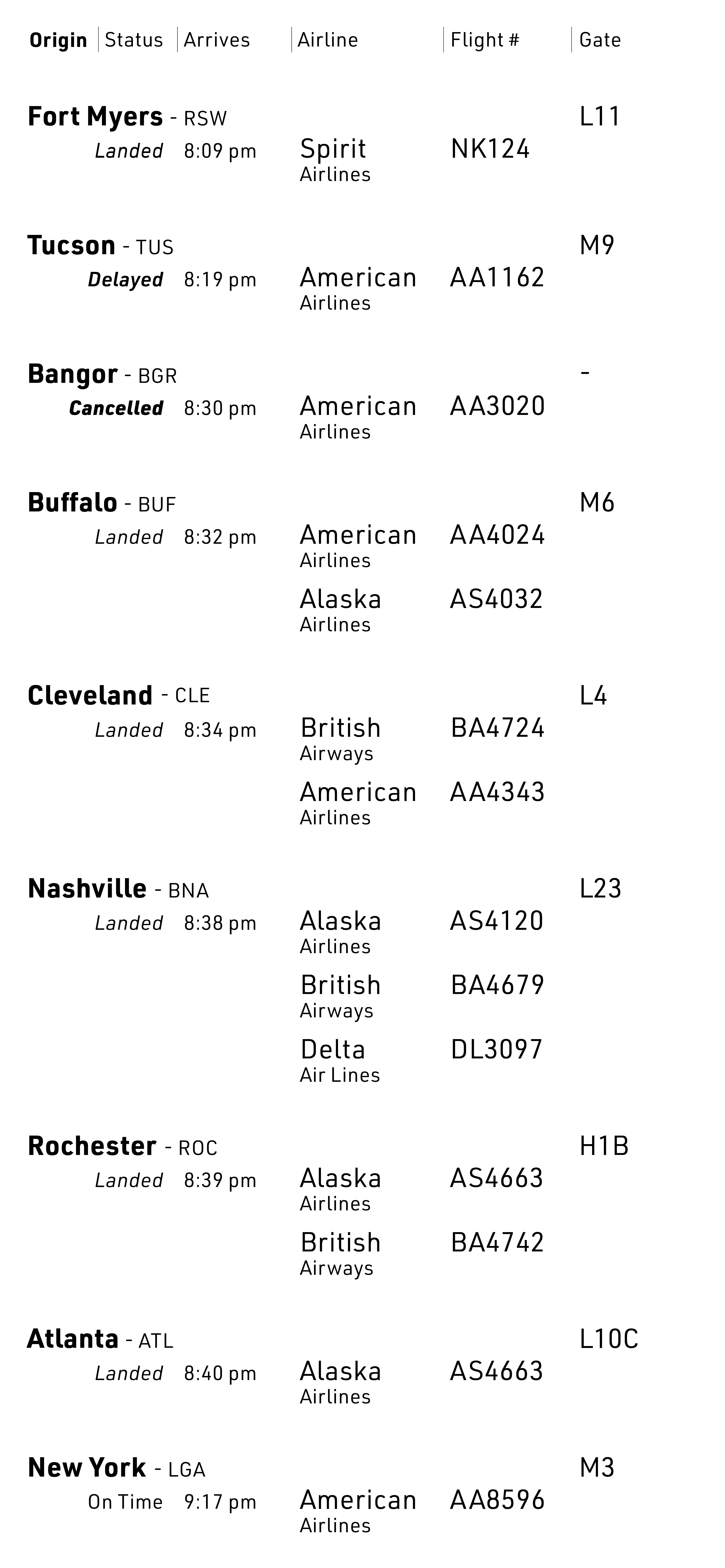
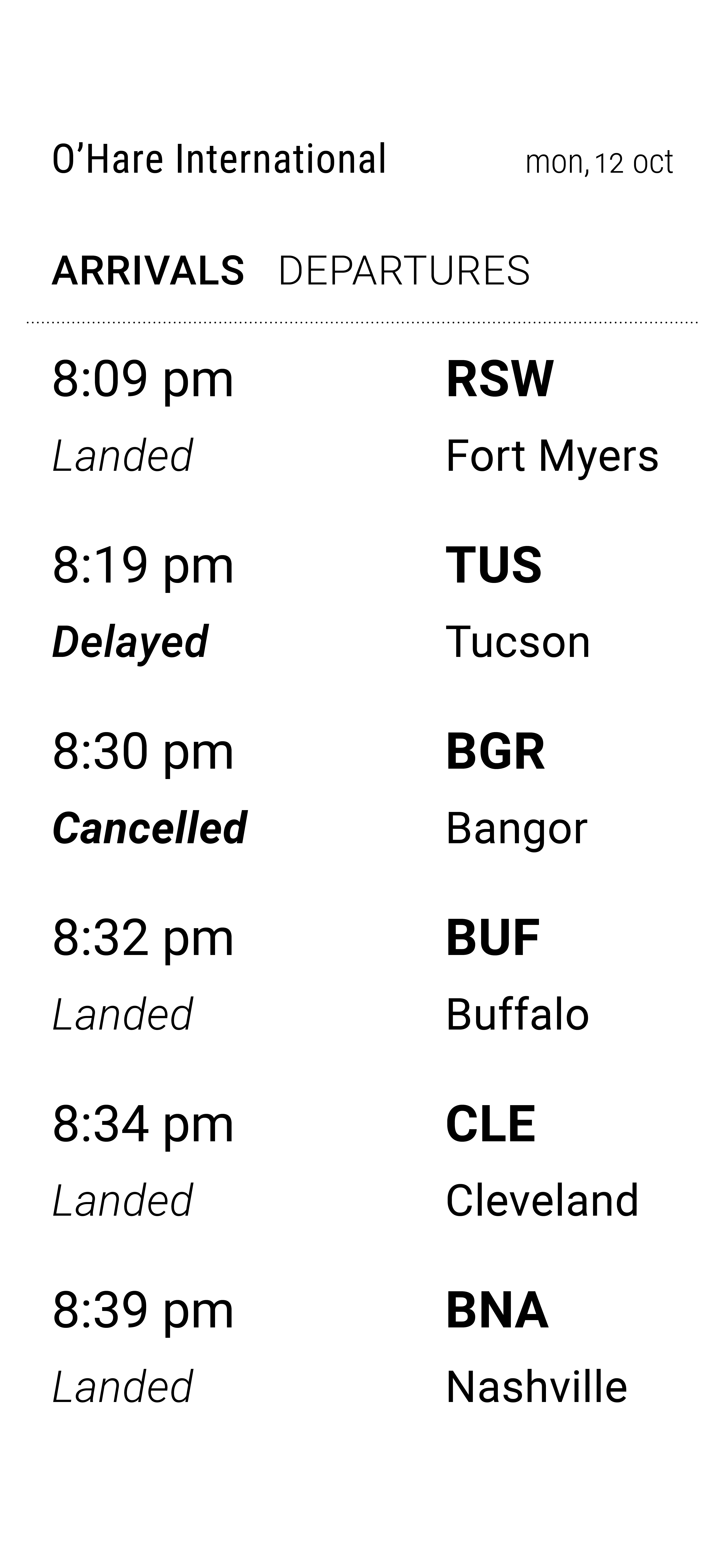
The project focused on establishing hierarchy and organization through tabular typography. A strong emphasis was placed on simplicity and layout to maximize legibility and ease of navigation.
Concept Development
Layout iterations and process work as hiearchy and navigation were explored



Typeface
Roboto was chosen for its legibility and versatility and because it was specifically designed for mobile interfaces.
![]()
Final color harmony
The intended tone of the interface is friendly and bright, reminding users of how it feels to be on vacation.
![]()
Roboto was chosen for its legibility and versatility and because it was specifically designed for mobile interfaces.

Final color harmony
The intended tone of the interface is friendly and bright, reminding users of how it feels to be on vacation.

Color
A primary color harmony was first explored, but it did not convey the intended message. The look and tone did not result in the desired outcome.
![]()
![]()
![]()
A primary color harmony was first explored, but it did not convey the intended message. The look and tone did not result in the desired outcome.

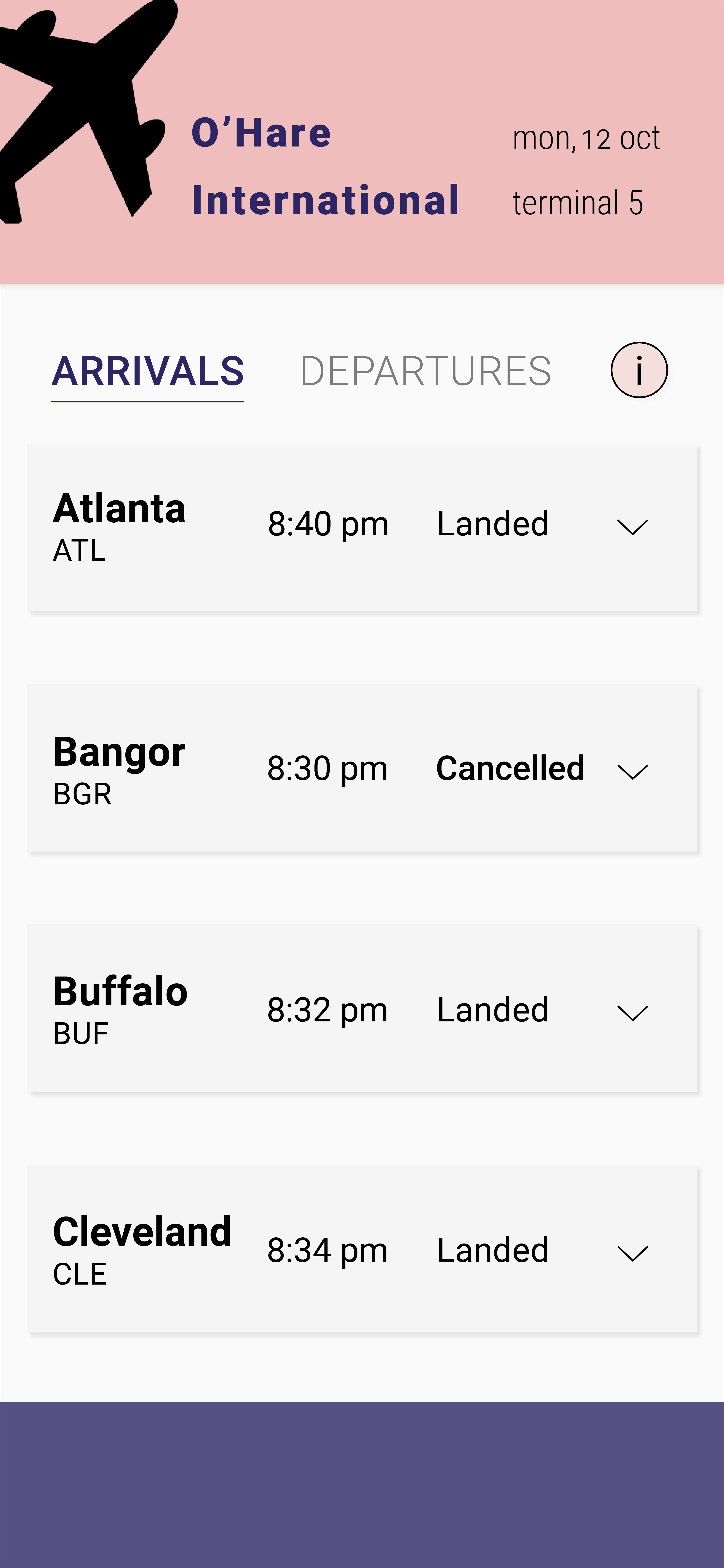
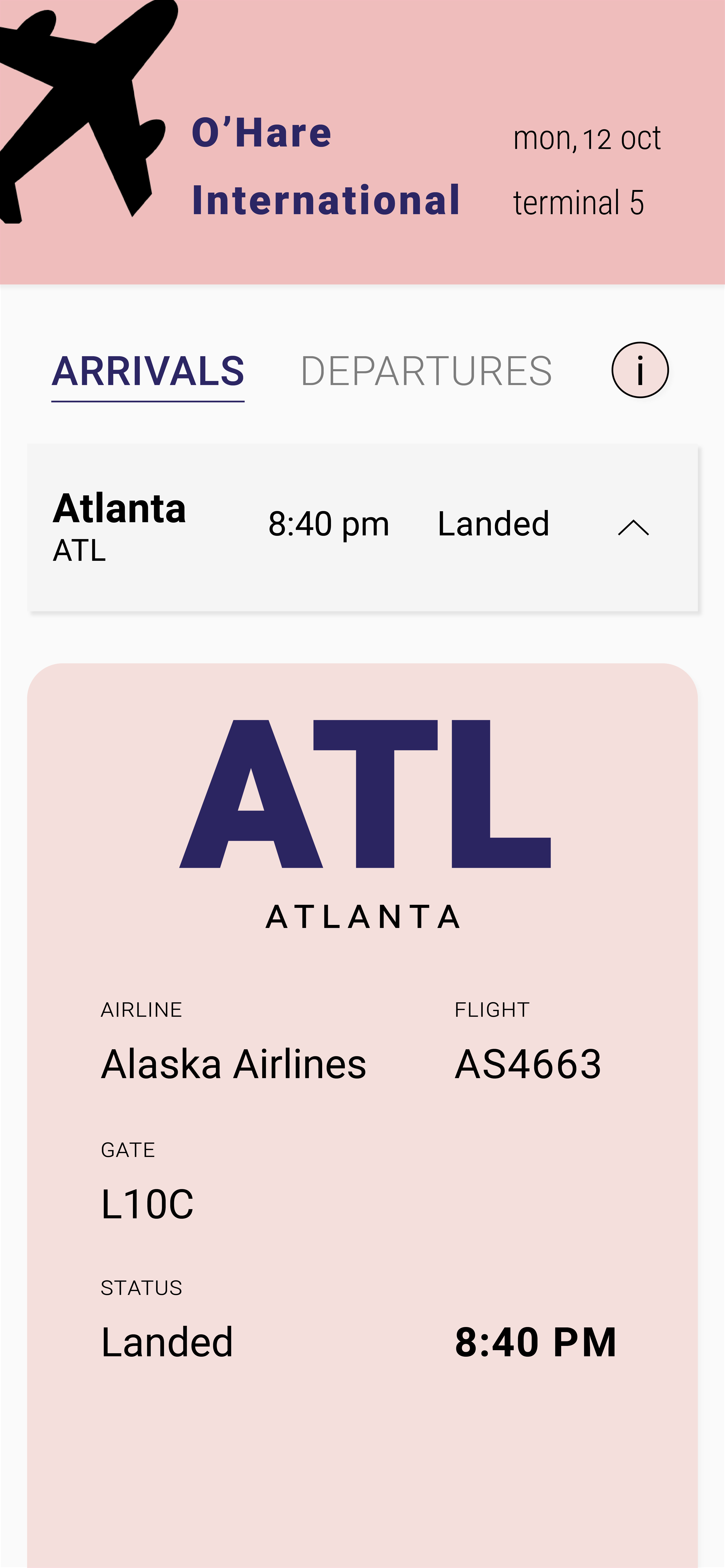
The colors needed to match the desired tone and encourage people to use the app through giving them a positive experience.
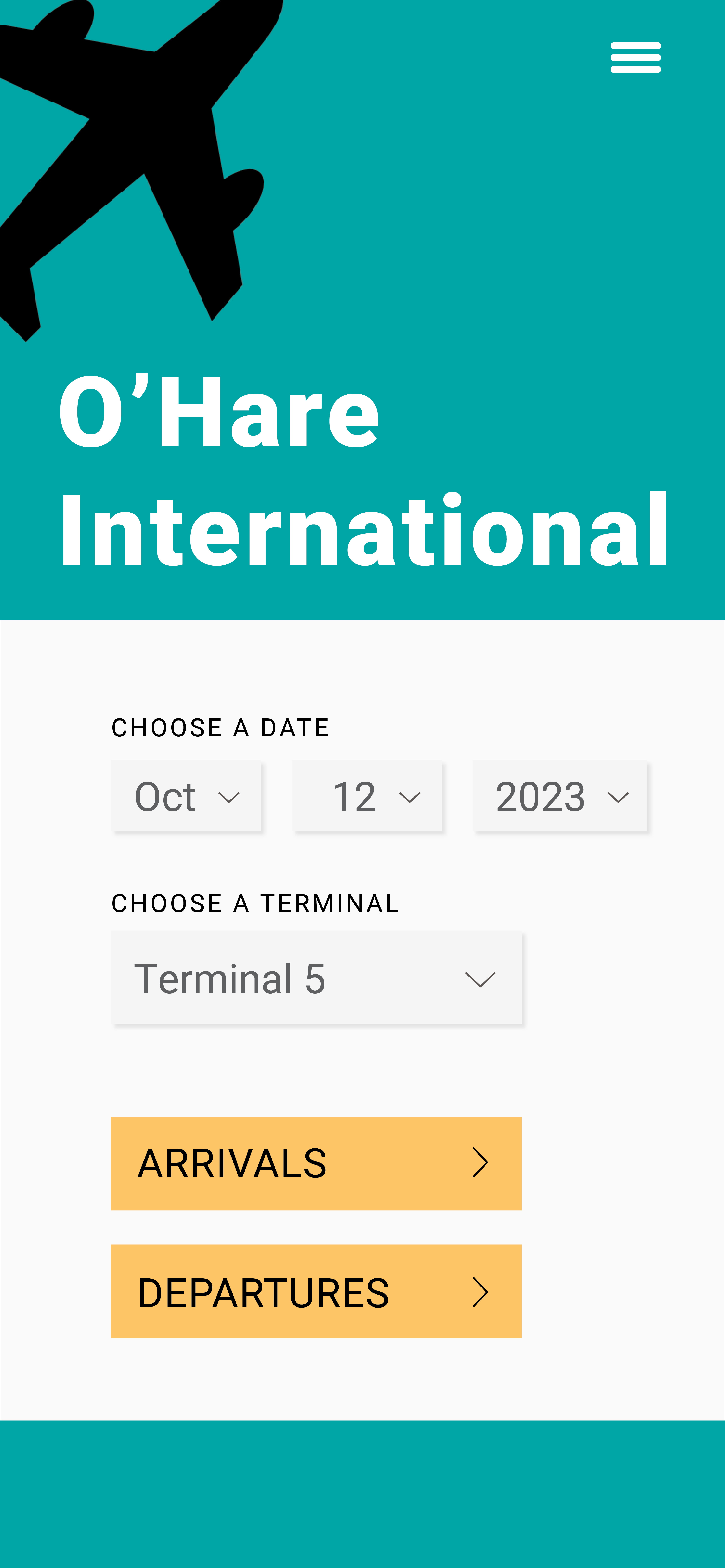
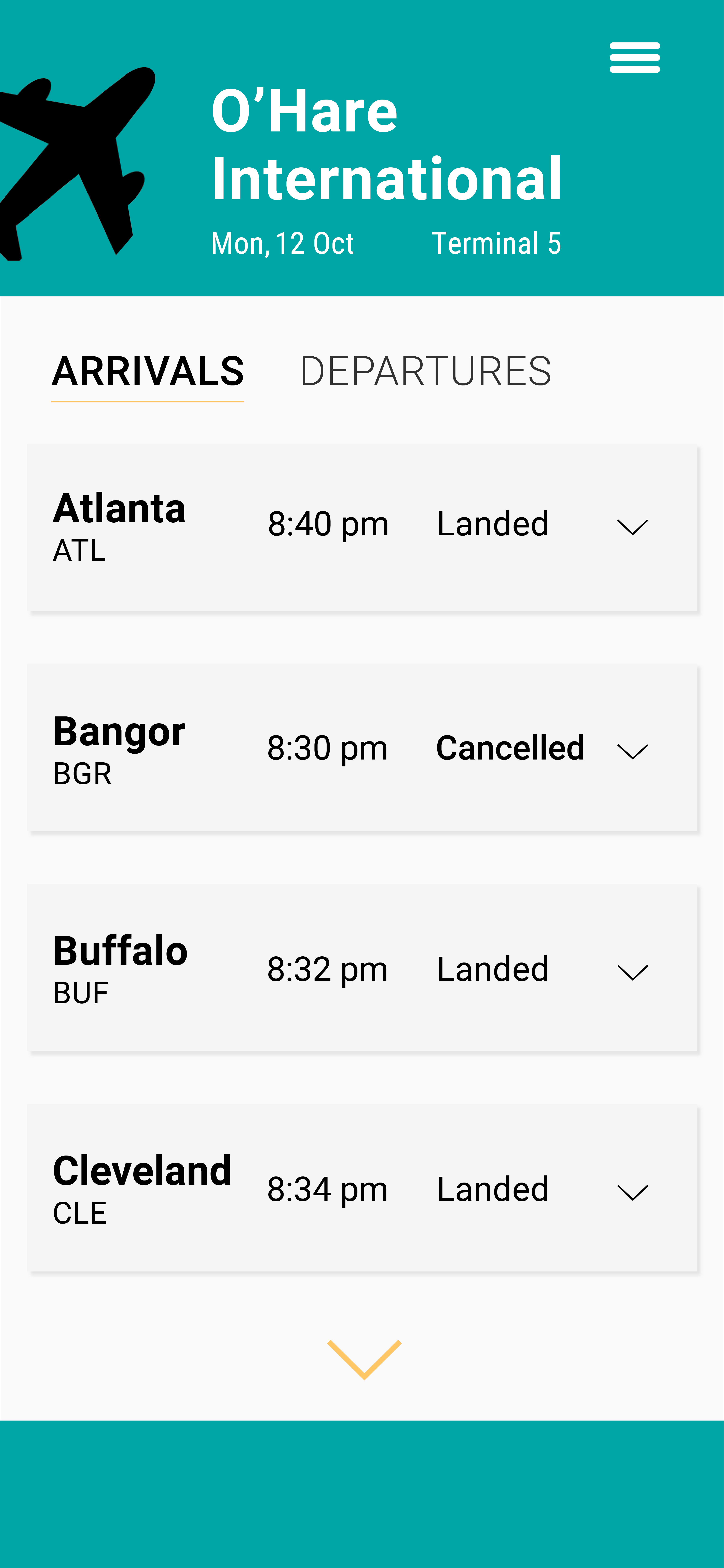


Final Solution
