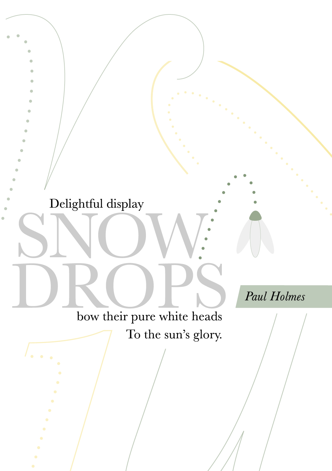
Traditional Haiku Poem


Project Description
An interpretation of a traditional haiku poem into a non-literal visual representation using graphic elements, type, and image.
Designed in the form of a booklet with a front cover, three full spreads (one for each line of the haiku) and the back cover.
An interpretation of a traditional haiku poem into a non-literal visual representation using graphic elements, type, and image.
Designed in the form of a booklet with a front cover, three full spreads (one for each line of the haiku) and the back cover.
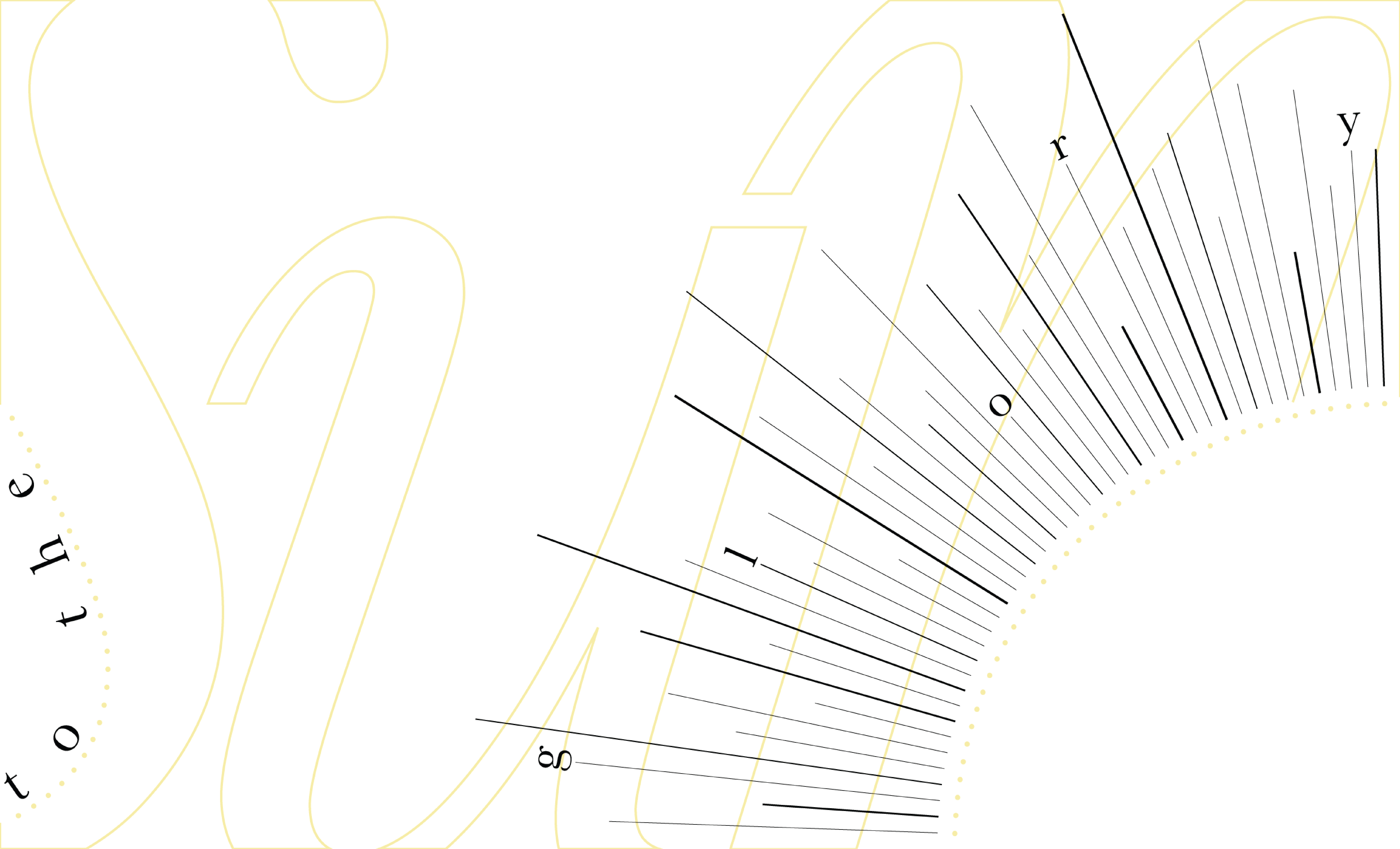
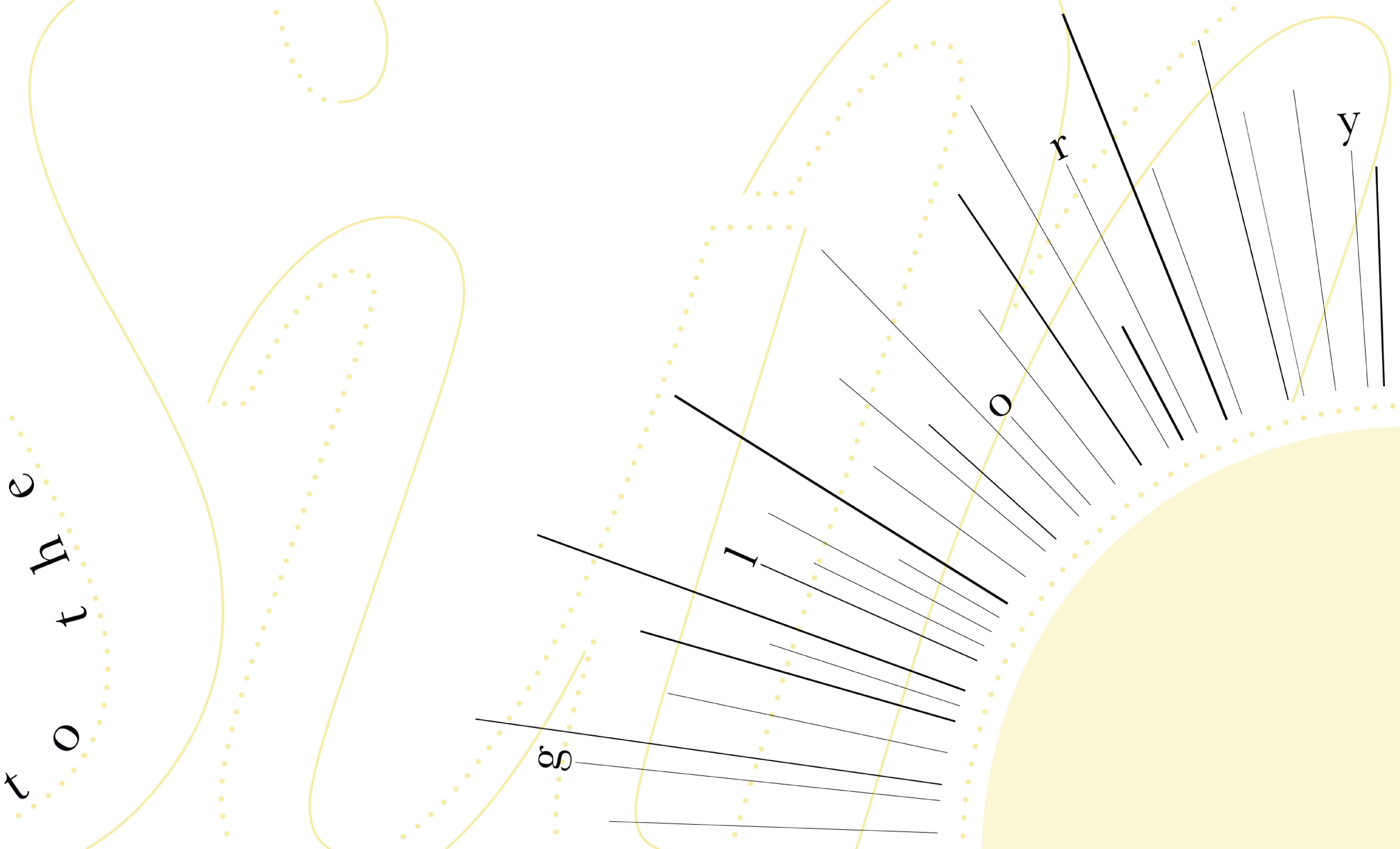
A consistent strategy across each spread considered hierarchy, complexity, cohesiveness, and relationship of elements. The spreads establish harmony while drawing on color and type to set the feel, tone, and story of the design.
Concept Development
First spread: Delightful display
![]()
![]()
![]()

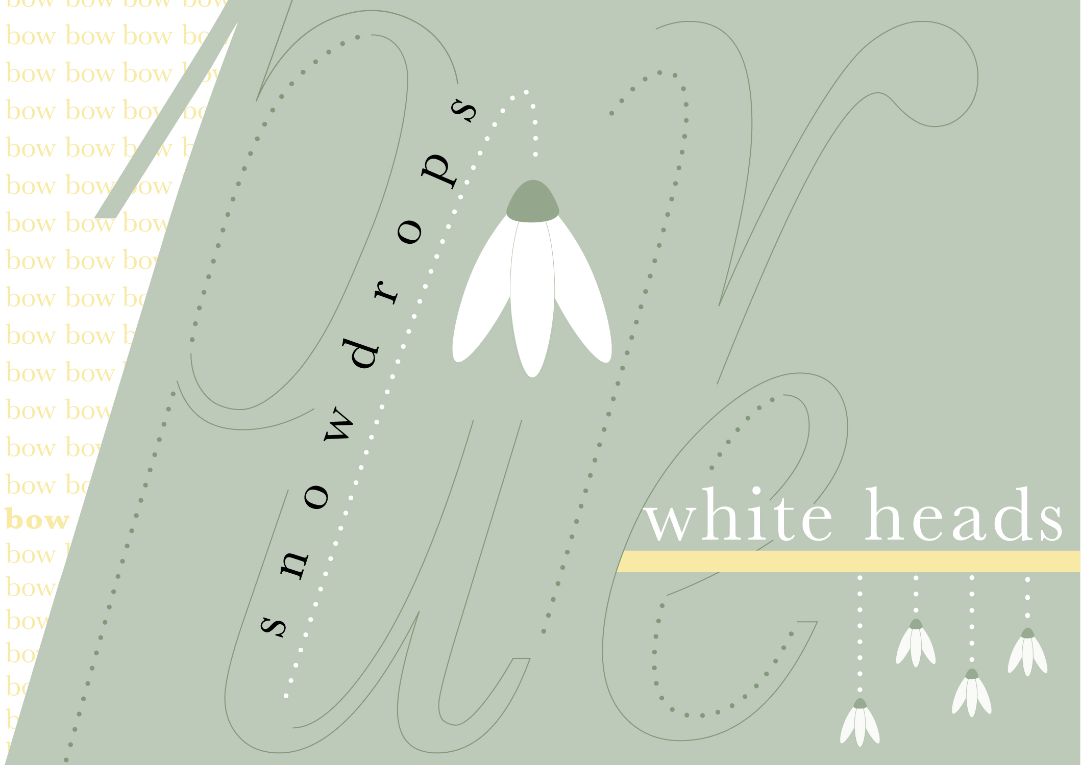
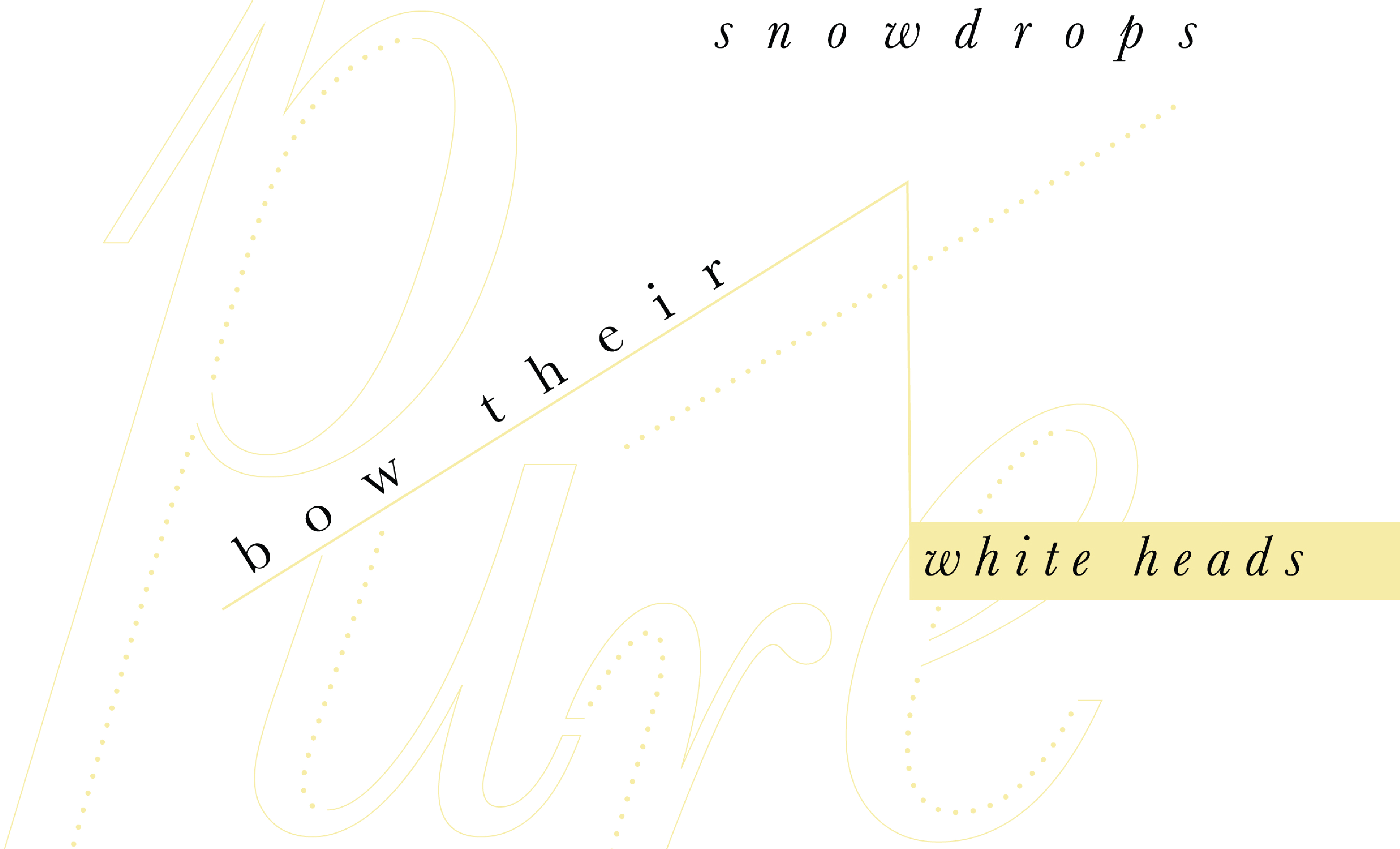
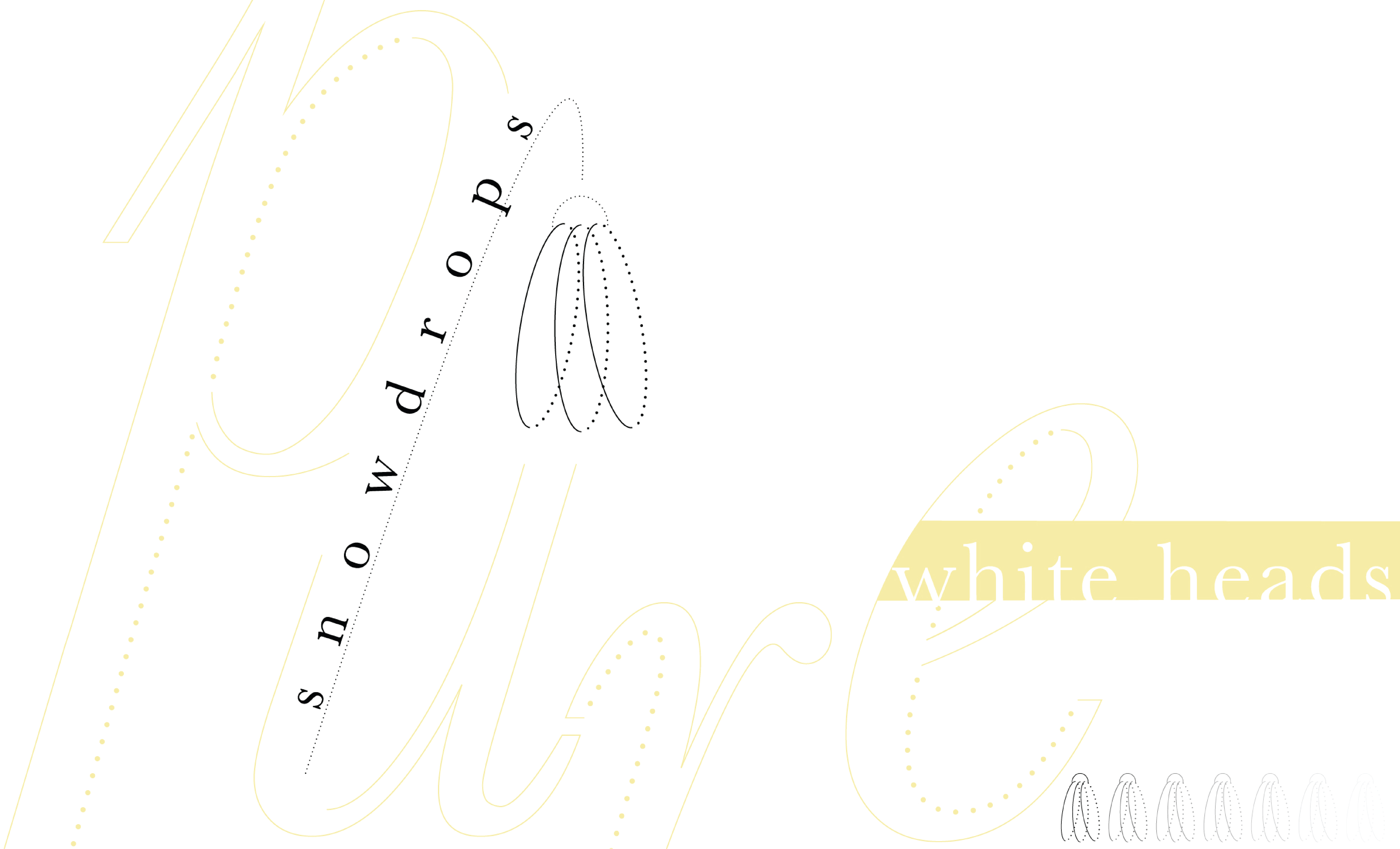
Second spread: Snowdrops bow their pure white heads
![]()
![]()
![]()

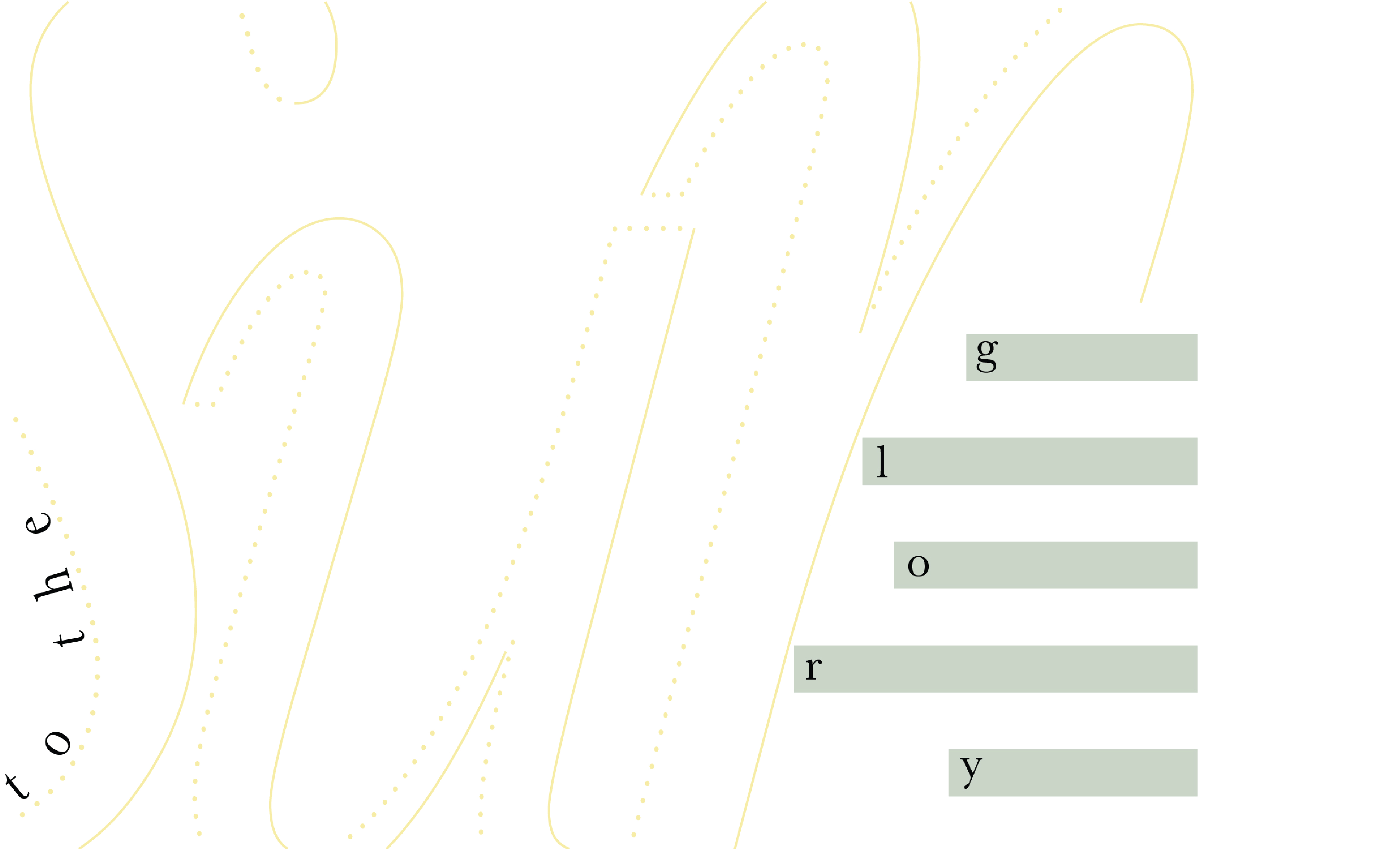
Third spread: To the sun’s glory
![]()
![]()
![]()
Cover iterations
The covers were done last with the same color harmony and graphic elements from the spreads. The whole haiku, including the author’s name, was incorporated on the back cover.
The covers were done last with the same color harmony and graphic elements from the spreads. The whole haiku, including the author’s name, was incorporated on the back cover.
Front cover
![]()

Back cover
![]()

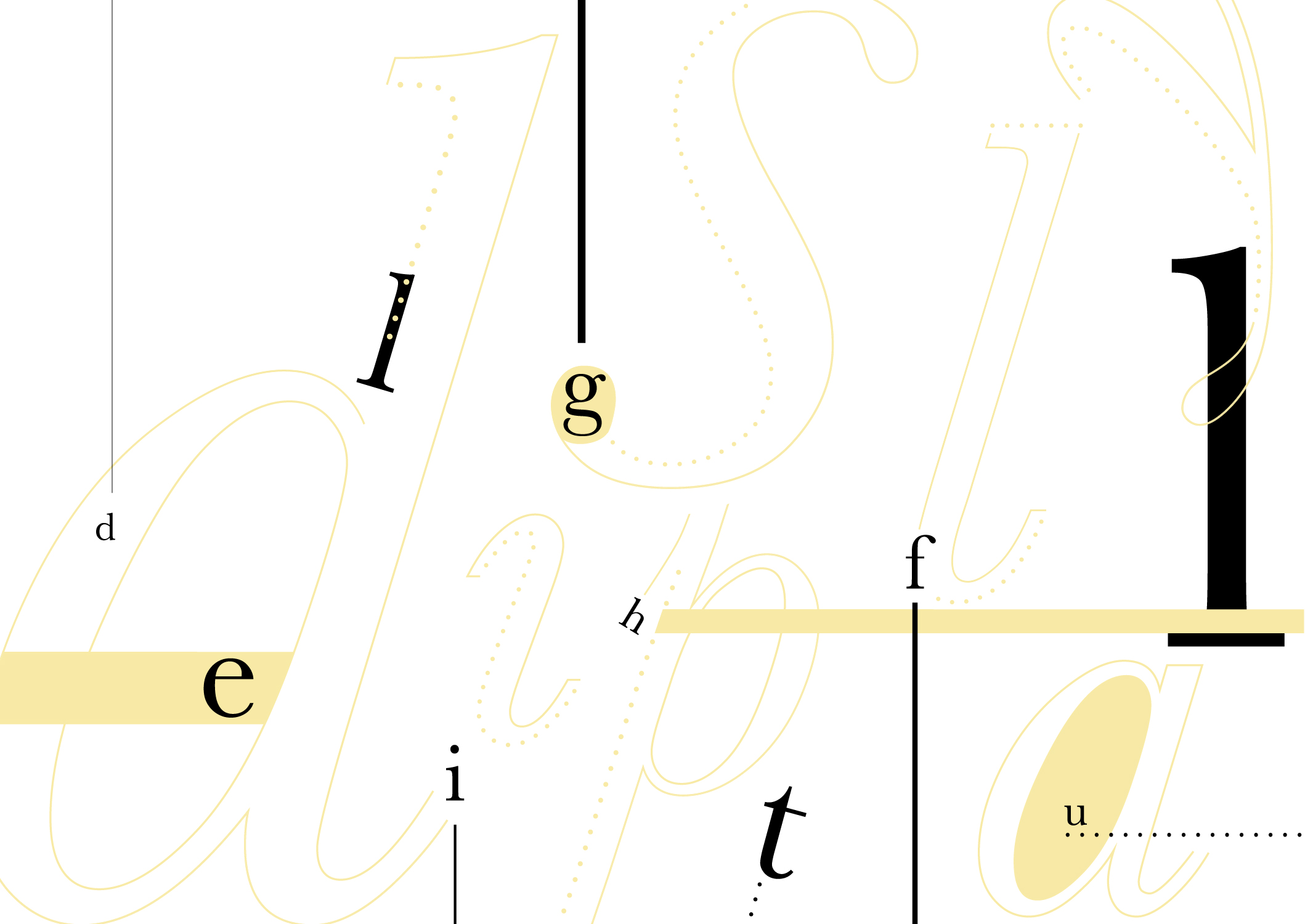
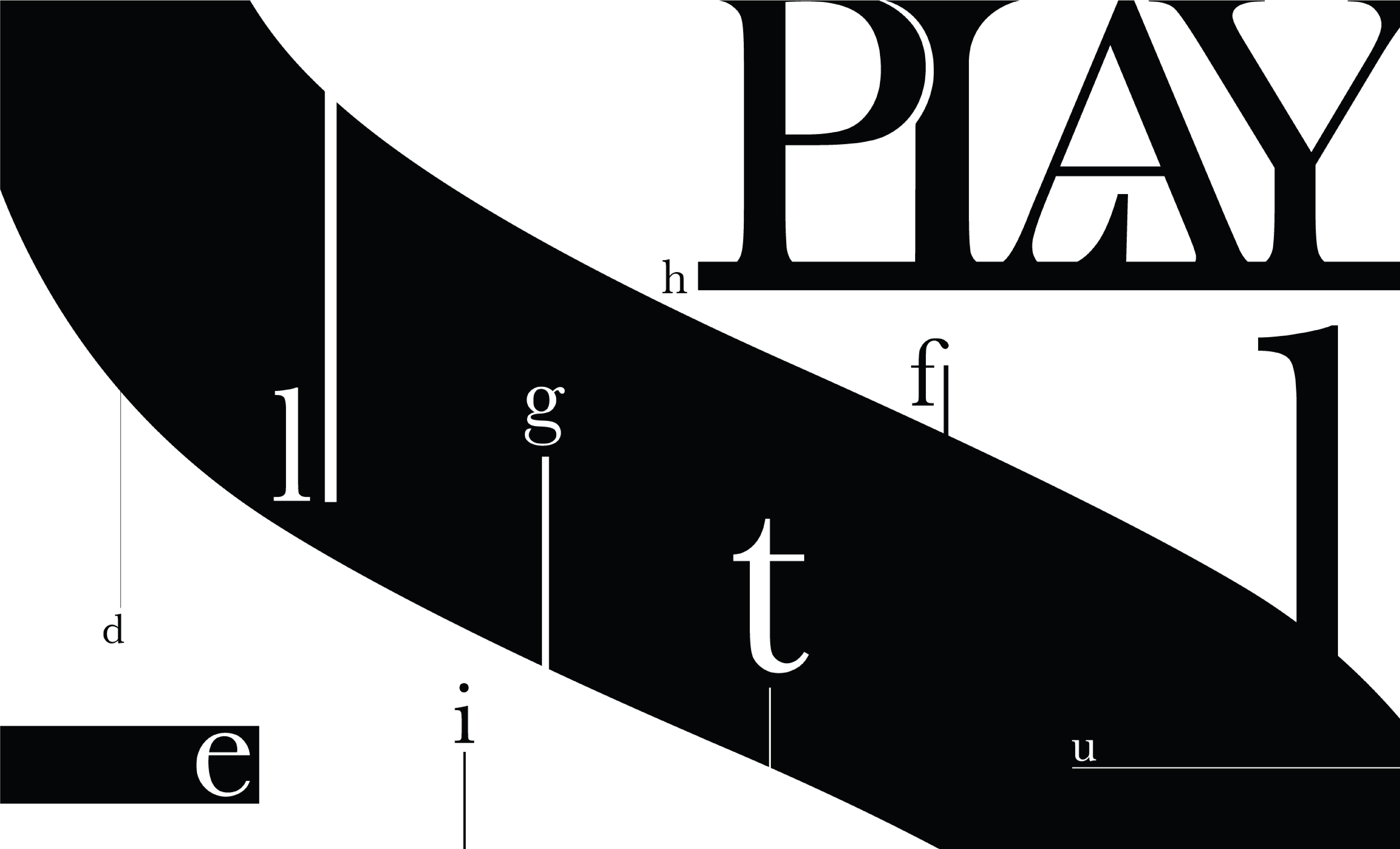
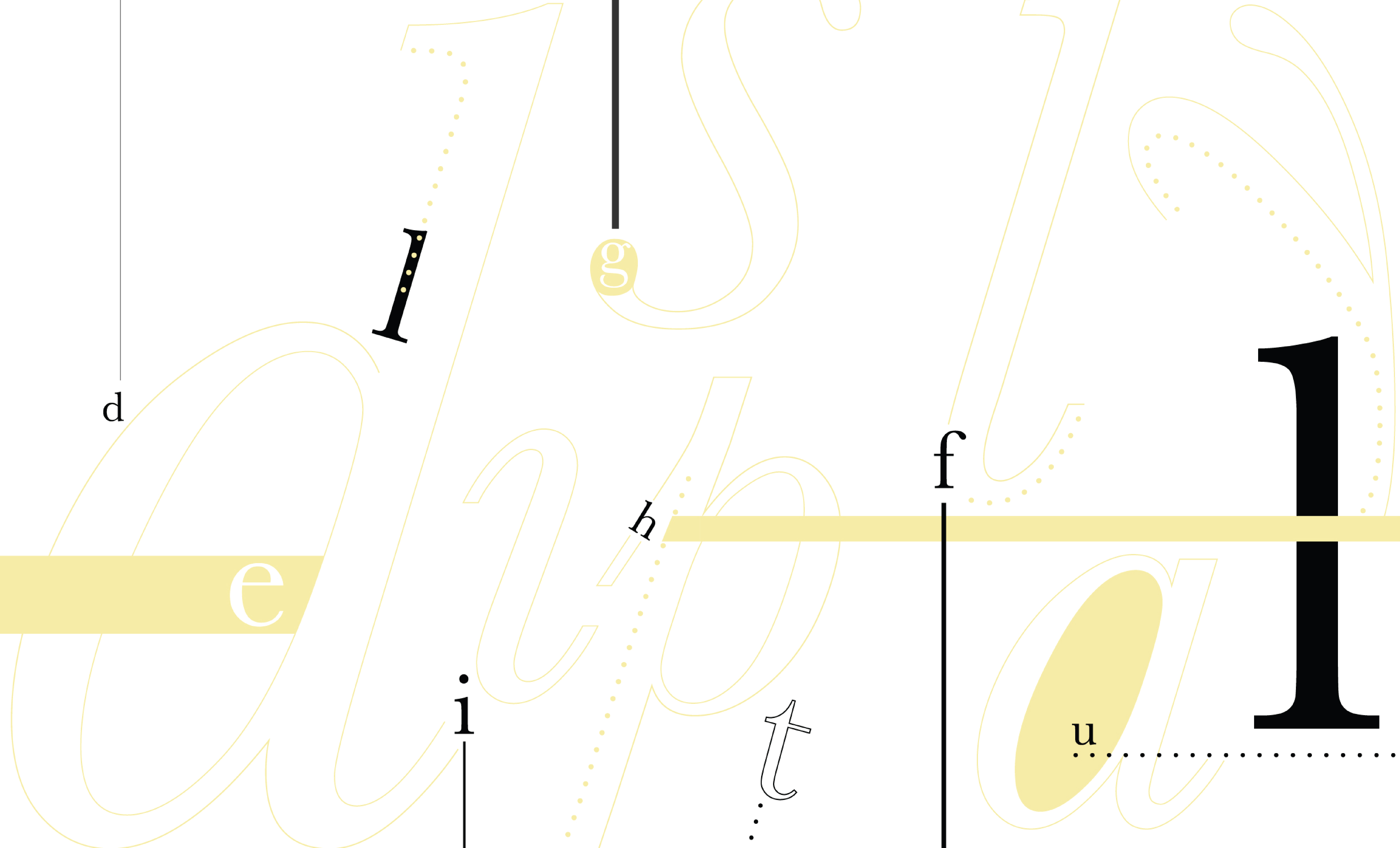
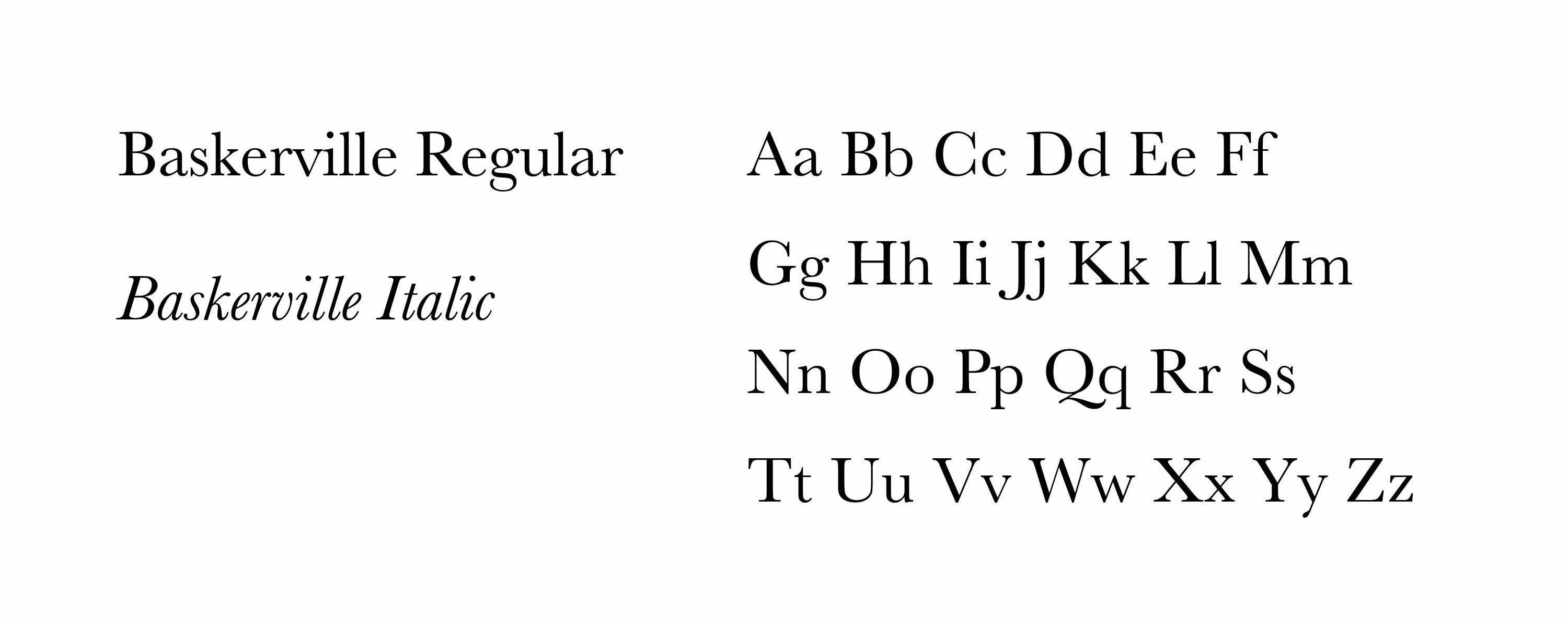
Final typeface
Several typefaces were explored. Baskerville was chosen for its reputation of legibility and elegance. The italic font additionally provided elegant curves for the haiku interpretation.
![]()
Several typefaces were explored. Baskerville was chosen for its reputation of legibility and elegance. The italic font additionally provided elegant curves for the haiku interpretation.
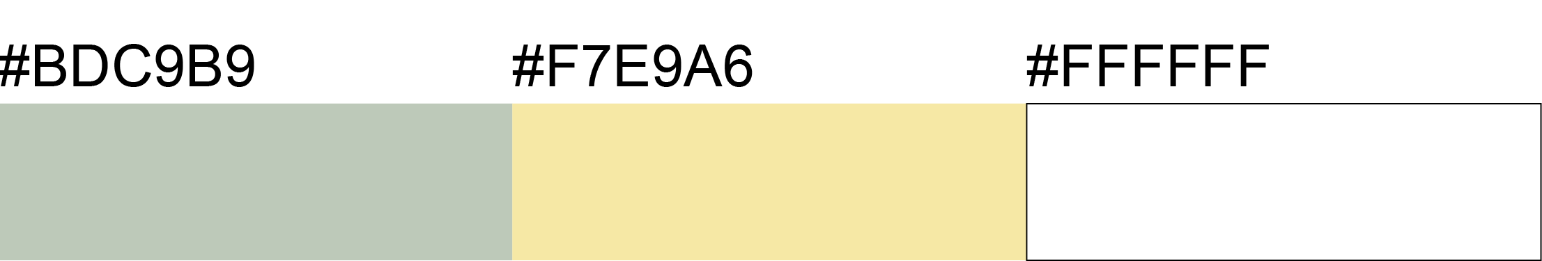
Color
Green was chosen to symbolize nature and the haiku is about flowers. Yellow was chosen for its association with the sun and happiness, relating to the first and last lines of the haiku.
![]()
Green was chosen to symbolize nature and the haiku is about flowers. Yellow was chosen for its association with the sun and happiness, relating to the first and last lines of the haiku.
Final Solution